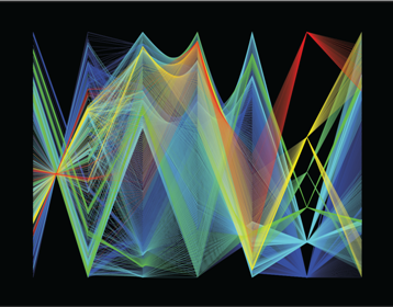
 I am happy to announce Sliver, a free software application I wrote over the last two years for multivariate data visualization. Sliver includes parallel coordinate (PC) plots, PC plot matrices, various types of configurable 2D and 3D scatterplots, and plots overlaid on Google Earth, all fully linked by color brushing. Transparency (alpha blending) is supported as seen at left. Sliver also offers data animation, including Google Earth animation as well as the Grand Tour, a rotation through n-space that reveals correlations and structures in multidimensional data. Have a look!
This modern application may seem at odds with the theme of my blog, but in fact it was Maurice d’Ocagne who coined the term parallel coordinates in regard to his parallel scale nomograms. A hundred years later Alfred Inselberg extended this idea of parallel scales as a way of visually analyzing multi-dimensional data. Inselberg and others make use of some of d’Ocagne’s work on point-line duality to characterize functional relationships between variables as structures and envelopes of the lines drawn between their axes.
In a parallel coordinate plot the axes of values for the variables lie parallel to each other, typically running vertically with a linear mapping from the minimum to maximum value of each variable. Each instance of measurement of the variables (i.e., each row of the input CSV data file) is represented by a segmented line, or polyline, that passes through the corresponding value on each variable axis. Correlated groups of lines can be color brushed, and this color brushing propagates across any other 2D or 3D plots generated from the data. The parallel coordinate plot shown here does not display axes or labels, but this larger version does display axes labels (best viewed by downloading and opening it rather than in your browser).
These highly visual displays reveal correlations, patterns, trends and anomalies in multivariate systems, and these in turn can significantly aid in the diagnostic analysis of sensitivities and error sources in a system. I have been an advocate of nomograms as system models, and this aspect of parallel coordinate plots is what drew me to study them and ultimately to create Sliver. This linkage will be more complete when I report later on the use of Sliver to test an application of nomograms to image processing.

Congratulations on the release of Sliver! As you know I am extremely impressed by your Chicago Marathon mapping utilizing the Google Earth Plotting feature.
Thanks, Brian! You were the first to see Sliver features as I developed them, and I always appreciate your input on my projects.
LikeLike
Very impressive. I’m going to have to play around with it — do you have examples of where you might have used it for publication or presentation?
Also, I thought this blog had been abandoned! it’s been quite a long time since I’ve seen updates (I come back every once in a while because this website gets a lot of references in the online nomograph literature).
Thanks, James. I just released Sliver, and I haven’t used it in publications. I’ve used it at work to explore flight data to identify factors that caused errors in the system I work on, but that is not public of course. The sample screenshots I have on the Sliver site are all personal efforts such as analyzing marathon race data to test Sliver and provide plots to runners I know.
I’ve been very remiss on posting articles here, but I have a lot of material backed up for posting so I will be doing more of that. I’ve been busy with a lot of other things, including co-authoring a book on nomography, writing and testing Sliver, etc. When I started the blog I had the thought that I would avoid starting a post by apologizing for taking so long between posts, as then I wouldn’t feel pressure and could take my time researching long articles. Well, given the long time it’s been since my previous post I really need to do that! I am also backed up on responding to comments here, which I’m also trying to rectify now.
Thanks again for your interest, and you will be seeing more posts here in near future. — Ron
LikeLike
This is beautiful Ron thank you very much. You may want to look up “Parallel Coordinates: Visual Multidimensional Geometry and Its Applications” Springer 2009. There are patterns for multivariate/multidimensional RELATIONS which are much more
compact and informative than the bunches of polygonal lines. Many of them are also very aesthetic and useful. Good luck and please keep me informed.
LikeLike
Great representation of multivariate data visualization!
LikeLike
Great representation of multivariate data visualization!
LikeLike